
How to Get a Renovation Quote in Melbourne You Can Actually Rely On
Most “quotes” aren’t quotes. They’re vibes with a number attached.
If you’re renovating in Melbourne, where trades are busy, lead times can blow out, and older housing stock loves to surprise you behind the plaster, you want a quote you can lean on when things get real. That means you need clarity on scope, proof the builder can legally do the work, and paperwork that doesn’t fall apart the minute someone says “variation”.
One line to remember: If it isn’t written down, it isn’t included.
Start with the scope (because everything else depends on it)
Before you ask anyone for pricing or get a renovation quote in Melbourne, get brutally clear on what you’re building. Not the Pinterest version. The actual version you can afford, approve, and live through.
Write a short project brief that answers:
– What areas are being renovated (kitchen only, kitchen + laundry, full ground floor, etc.)
– What “done” looks like (layout changes, extra storage, better light, accessibility, thermal performance)
– Your constraints: budget ceiling, must-keep items, dates you can’t miss
– Any site realities: narrow access, heritage overlays, strata rules, you living in the home during works
Then add taste. Not endless mood boards, just decisions that shape cost: floor type, benchtop material, tapware tier, cabinetry style, appliance level. Trades can’t quote accurately on “mid-range finishes” because “mid-range” means wildly different things to different people.
In my experience, the cleanest quotes come from clients who can describe the job in plain English and still provide specifics where it counts.
A slightly uncomfortable truth about “ballpark” pricing
Ballparks are how budgets die.
Now, this won’t apply to everyone, but if you ask three builders for a rough number before you’ve locked scope, you’ll get three numbers that aren’t really comparable, and you’ll pick the one that feels best emotionally. That’s how people end up shocked halfway through demolition.
A reliable quote needs enough detail that two separate contractors could price the same job and land in the same universe.
Licences, insurance, credentials: don’t outsource your own protection
You’re not being “difficult” by asking for documentation. You’re being normal.
At a minimum, you want to verify:
– Correct registration/licensing for the type of work being done
– Public liability insurance (current, with adequate cover)
– Workers compensation (if they have employees; and yes, confirm it)
Here’s the thing: a certificate handed over on a PDF isn’t the finish line. Check expiry dates. Match the business name to the contracting party. If something doesn’t line up, pause.
Also, Melbourne-specific experience matters more than people admit. Renovating a 1970s brick veneer in Doncaster isn’t the same as touching a Victorian terrace in Carlton, and anyone claiming it’s “all the same” probably hasn’t had to chase a surprise subfloor issue while the client is still living upstairs.
What a written quote must include (or it’s not a quote)
A dependable renovation quote reads a bit like a mini-specification. Not pages of fluff, clear line items, clear boundaries.
Inclusions vs exclusions (get surgical)
You want explicit separation between what’s included and what’s excluded. If those lists are vague, your final cost won’t be vague, it’ll be higher.
Examples of inclusions you should see written down:
– Demolition and waste removal (and how many skips)
– Labour by trade (carpentry, electrical, plumbing, plaster, tiling)
– Materials and products (brands/levels, allowances where needed)
– Permits/inspections (who handles them, who pays)
– Site protection (dust control, floor protection, temporary fencing if relevant)
Common exclusions that cause fights:
– Asbestos removal
– Structural remediation once walls are opened
– After-hours work, parking permits, traffic management
– Utility upgrades (switchboard, sewer, stormwater surprises)
– Painting “by owner” assumptions that quietly become “by builder” later
One-liner for your checklist:
If “standard” appears in the quote, ask what “standard” actually means.
Assumptions and contingencies (where the hidden costs live)
This is the grown-up part of the quote. Assumptions tie the price to conditions: access, working hours, lead times, the state of existing framing, whether floors are level (often they’re not), and so on.
Contingencies should be named and bounded. “Contingency: $X for unforeseen structural issues” is better than “contingencies may apply,” which is basically a blank cheque dressed up as professionalism.
A quick data point, since Melbourne budgets have been jumpy: the Australian Bureau of Statistics recorded year-on-year increases in construction input costs during recent years, which has flowed through to renovation pricing and lead times (ABS Producer Price Indexes / Building Construction indexes, ABS). That doesn’t mean you accept sloppy quoting, it means you demand clearer allowance logic and escalation clauses that aren’t predatory.
Timelines: show me the plan, not the dream
I don’t want “8, 10 weeks” unless it’s backed by a sequence.
Ask for a schedule that shows:
– pre-start (documentation, ordering, approvals)
– demo
– rough-in services
– waterproofing and inspection timing
– cabinetry lead time and install
– finishes
– practical completion and defects
Look for dependency logic. If cabinetry is 8 weeks from final measure, then a “6-week” kitchen renovation timeline is fantasy unless they’re warehousing product already.
Also, small thing, big impact, get clarity on what dates are targets and what dates are commitments. Those are not the same.
Payment terms: the quiet indicator of whether a builder is organised
A payment schedule should map to visible milestones. If it doesn’t, you’re financing someone else’s cashflow problems.
I’m opinionated here: avoid heavy upfront deposits that aren’t tied to measurable procurement or deliverables. Deposits can be reasonable, but “pay 40% before we start” is a red flag unless there’s a clear materials purchase plan and evidence those items are being ordered for your job.
You also want the variation (change order) process written down in a way a tired person can still follow at 9pm.
It should state:
– how variations are requested (in writing)
– how they’re priced (fixed price, schedule of rates, margin)
– what happens to the timeline
– that work doesn’t proceed until you approve the variation price and time impact
Look, variations happen. The problem is “surprise variations” that magically appear after the work is done.
References: don’t just ask if they were “happy”
Ask questions that force specifics. You’re trying to predict behaviour under stress.
Good reference questions:
– Did they start and finish close to the agreed timeframe? If not, why?
– How often did variations occur, and were they justified?
– Was the site kept safe and reasonably tidy?
– What happened when something went wrong?
– Would you hire them again at the same price?
If they can point you to a similar Melbourne project, same style of house, similar constraints, that’s gold. Bonus points if the reference is within the last 12, 18 months; crews change, subcontractors rotate, and a company’s “best year ever” can be a long time ago.
Contracts and change governance (the part people skip, then regret)
Ask for a sample contract early. Not after you’ve fallen in love with the builder.
Your contract should cover scope, payment milestones, warranties, defect liability period, delay provisions, dispute resolution, and termination rights in plain language. If it reads like it was copy-pasted from somewhere weird online, that’s your cue to slow down.
Change governance is where good operators stand out. A solid builder won’t be offended by structure, they’ll welcome it because it protects them too.
One-line paragraph, because it deserves it:
Paperwork is part of the build.
A side-by-side comparison method that actually works
When you’ve got multiple quotes, don’t compare totals first. Compare the bones.
Make a simple matrix. Nothing fancy. Rate each builder (1, 5) on:
– Scope clarity (do you know exactly what you’re getting?)
– Price transparency (allowances explained? exclusions obvious?)
– Timeline realism (milestones + procurement logic)
– Contract quality (variation process, delays, defects)
– Communication (speed, clarity, no evasiveness)
– Local project proof (relevant references, similar homes)
– Risk flags (vague wording, missing insurance proof, strange payment terms)
Then look at the totals. Often the “cheapest” quote is just the one with the most missing pieces.
And if two quotes are close? Pick the builder who documents better. I’ve seen that single factor save people months of stress.
Final thought (not a wrap-up, just the point)
A reliable renovation quote in Melbourne isn’t luck. It’s a process: sharp scope, verified credentials, itemised pricing, explicit assumptions, real scheduling, sane payment terms, and a contract that can handle change without drama.
If a contractor can’t, or won’t, give you that… you’ve learned something valuable before spending a cent.
Why Pilates in Geelong Has Turned Into a Real Community (Not Just a Timetable)
Geelong didn’t “discover” Pilates. It built a culture around it.
Walk into a few local studios and you’ll feel the difference fast: classes that don’t act like you’ve already memorized the reformer, instructors who remember names, and a vibe that’s more practical coastal city than boutique fitness theatre. That’s the root of the growth. Not hype. Not hashtags. Repetition, trust, and a steady stream of beginners who actually stick around.
One-line truth: Geelong’s Pilates scene grew because it’s designed for normal people.
Hot take: beginner-friendly Pilates isn’t “easier,” it’s smarter
Some places treat beginner programming like a watered-down version of the “real” work. I don’t buy that. In my experience, the studios that obsess over foundations create the most consistent long-term movers, and pilates in Geelong leans hard into that mindset.
You’ll notice it in small choices:
– onboarding that’s structured (and not awkward)
– progressions that don’t jump too quickly
– instructors cueing breath and alignment like it actually matters
– class caps that protect quality instead of maximizing bodies-per-square-metre
Here’s the thing: Pilates only looks gentle when it’s coached well. When it’s coached lazily, it becomes confusing or, worse, risky.
Geelong as a “hub” works because the barrier to entry stays low
This won’t apply to everyone, but most beginners don’t quit because Pilates is too hard. They quit because they feel behind, singled out, or lost.
Geelong studios tend to reduce that friction. Intro packs and orientation-style sessions are common, and the gear is usually set up to help people learn rather than just survive. Resistance bands. Boxes. Poles. Springs that are chosen for control, not ego. All of that sounds basic, yet it’s the difference between “I might come back” and “this is my new routine.”
Also, the waterfront atmosphere changes the tone. People come in already calmer, already in a “walk it off, reset, try again” mindset. That’s not fluffy psychology; it’s adherence science dressed as lifestyle.
Studio collaboration: the unsexy reason the whole scene is growing
Some fitness markets get territorial. Geelong, from what I’ve seen, trends the other way: studios cross-pollinate.
Sometimes that’s formal joint workshops, sometimes it’s informal instructor coverage, sometimes it’s just shared language around safety cues and regressions. It matters because practitioners don’t feel like they’re starting from scratch every time they try a different venue.
A few concrete ways collaboration shows up:
– shared workshop calendars that avoid clashing major events
– standardized injury-prevention cueing (hips, ribs, scapula control, same emphasis)
– pop-in specialist sessions (physio-informed coaching, pre/postnatal blocks, mobility intensives)
– hybrid/virtual drop-ins that let instructors teach across locations without the commute
And yes, the outcome is measurable. The Australian Pilates Method Association reports steady growth in Pilates participation nationally, tied to health/rehab crossover and mainstream adoption (APMA, participation trends and industry commentary: https://www.australianpilatesmethodassociation.com.au/). Geelong is basically a localized version of that macro trend, amplified by cooperation instead of competition.
A quick note on data: studios are tracking more than attendance now
Ten years ago, “progress tracking” in Pilates was mostly vibes. Now it’s check-ins, movement screens, structured levels, and feedback loops that are visible to members (which keeps people engaged).
Some Geelong studios use simple metrics, sessions attended per month, milestone movements achieved, pain or stiffness ratings before/after blocks. Others are experimenting with tech-assisted form feedback and breath pacing (not perfect, but improving). The point isn’t to turn Pilates into a lab. It’s to remove guesswork.
Look, numbers don’t motivate everyone. But they reduce confusion. And confusion is what kills consistency.
Reformer to waterfront: why the “shared rhythm” idea isn’t just poetic
You’ll hear locals talk about reformer classes like they’re part of the weekly geography: do a session, walk the foreshore, coffee, back to life. That routine sounds casual, but routines are powerful because they eliminate negotiation.
What’s interesting in Geelong is the way reformer programming is starting to sync across pockets of the city. Familiar warm-ups. Similar tempo. Comparable core sequences. That creates a kind of portability: people can move between studios and still feel competent.
And competent people don’t quit.
Some studios even weave in waterfront-adjacent movement cues, balance work that borrows from outdoor footing, breath pacing that matches walking cadence, cool-downs that feel like they belong near the bay. Is it essential? No. Is it sticky? Absolutely.
The beginner welcome isn’t accidental; it’s operational
A welcoming vibe is nice. A welcoming system is what actually scales.
Geelong studios that retain beginners tend to do a few operational things consistently:
– short intake conversations that uncover injuries and goals (without turning into therapy)
– beginner class categories that aren’t treated as second-class offerings
– micro-corrections delivered quietly and respectfully (nobody wants to be corrected like a schoolkid)
– progression paths that are explained plainly: “Do this for four weeks, then we level up.”
You can feel when a studio has built its business around beginners becoming regulars. The coaching is more patient. The programming is less chaotic. The room feels safer.
What’s next in Geelong Pilates (and who benefits)
If the next phase goes well, it’s going to reward three groups:
1) The cautious newcomer
People who want clear guidance, not intimidation. Expect more intro series, more beginner-technique clinics, and smarter scaffolding.
2) The long-term regular
More variety without losing coherence: specialty workshops, guest instructors, and blocks that build capacity over time instead of random “burn” sessions.
3) The next generation of instructors
Mentorship models are becoming a bigger deal, pairing newer teachers with senior coaches so cueing quality stays consistent. In my opinion, this is the quiet backbone of a strong Pilates city. You can’t fake good teaching for long.
Community-led workshops and open-house demos will probably keep expanding too, because they do something marketing can’t: they let people try Pilates without feeling like they’re committing to a new identity.
If you’re thinking of joining, start where the culture is clearest: a true intro program, a studio that welcomes questions, and a schedule you can repeat without heroics. Consistency beats enthusiasm. Almost every time
Confident Strategy Planning Comes Through VolRadar Trading Insights
Successful trading often depends on the ability to evaluate opportunities clearly and make informed decisions with confidence. Access to meaningful insights can help traders understand market behavior, assess potential outcomes, and create structured plans that align with their objectives. Tools such as the VolRadar options profit calculator extension can support this process by helping traders visualize different scenarios and strengthen their overall approach to strategy development.
Understanding Market Opportunities More Effectively
A strong trading strategy begins with a clear understanding of market conditions. Insight-driven analysis helps traders identify patterns and evaluate opportunities with greater accuracy.
Key advantages include:
- Improved awareness of market movements
- Better evaluation of potential scenarios
- Greater confidence in decision-making
- Enhanced understanding of risk and reward
- More structured planning processes
These benefits contribute to a more organized and informed trading experience.
Strategic Planning Supports Better Decisions

Planning is an essential part of trading success. When traders have access to detailed insights, they can develop strategies that are both practical and adaptable.
Important planning elements include:
- Defining clear trading objectives
- Reviewing multiple potential outcomes
- Establishing entry and exit considerations
- Monitoring performance expectations
- Maintaining consistency in decision-making
A thoughtful planning process helps traders approach opportunities with greater confidence and clarity.
Visualization Improves Analytical Confidence
Visual representations of trading scenarios can simplify complex information. By organizing data into understandable formats, traders can evaluate possibilities more efficiently.
Benefits of visualization include:
- Easier interpretation of trading data
- Faster comparison of different strategies
- Improved understanding of potential outcomes
- More efficient analysis processes
- Greater confidence in planning decisions
These advantages help transform detailed information into actionable insights.
Data-Driven Insights Enhance Strategy Development
Reliable insights allow traders to move beyond assumptions and focus on information that supports informed decisions. Data-driven analysis encourages a disciplined and objective approach.
Positive outcomes of data-focused planning include:
- Better identification of trading opportunities
- Enhanced strategy refinement
- Improved consistency in analysis
- Stronger confidence in chosen approaches
- More effective long-term planning
This analytical framework helps traders build strategies that are supported by meaningful information.
Flexibility Creates Long-Term Value
Markets can change rapidly, making adaptability an important characteristic of successful trading strategies. Insight-based planning enables traders to adjust their approaches as conditions evolve.
Key benefits of flexibility include:
- Improved responsiveness to changing conditions
- Better preparation for different scenarios
- Enhanced strategic confidence
- Greater ability to manage uncertainty
- More balanced decision-making
Adaptable planning helps traders remain focused while responding effectively to new developments.
Building Confidence Through Insight
Trading confidence often grows when decisions are supported by clear analysis and structured planning. Access to valuable insights allows traders to evaluate opportunities, compare strategies, and refine their approach over time. By emphasizing preparation, visualization, and informed decision-making, insight-driven tools contribute to a more organized trading experience. As traders continue to seek effective ways to strengthen their strategies, comprehensive analysis and thoughtful planning remain essential components of achieving greater confidence and consistency in the market.
Experienced Lawyer Helps Simplify Complex Legal Processes Effectively
Legal matters can often seem complicated, involving extensive documentation, detailed procedures, and important decisions. For many individuals and businesses, navigating these challenges without professional guidance can be overwhelming. An experienced lawyer helps simplify complex legal processes effectively by providing clear direction, practical solutions, and reliable support throughout every stage of a case.
Understanding the Value of Legal Experience
Experience plays a significant role in managing legal matters efficiently. Lawyers with extensive knowledge of legal procedures understand how to address challenges, anticipate potential obstacles, and guide clients toward informed decisions.
By drawing on years of practical experience, a lawyer can streamline legal processes and reduce unnecessary confusion. This allows clients to focus on their personal or business priorities while feeling confident that their legal matters are being handled professionally.
Benefits of Working With an Experienced Lawyer
An experienced legal professional offers several advantages, including:
- Clear explanations of legal rights and obligations
- Efficient handling of legal documentation
- Strategic planning tailored to specific circumstances
- Timely responses to questions and concerns
- Thorough preparation for negotiations or proceedings
- Guidance that helps clients make informed decisions
These benefits contribute to a smoother and more manageable legal experience. Readers can look these up for verified supporting information.
Simplifying Complex Procedures

Legal processes often involve multiple steps, deadlines, and requirements. Missing important details can create delays and additional challenges. An experienced lawyer helps simplify these procedures by organizing information, managing paperwork, and ensuring that all necessary actions are completed accurately.
Rather than allowing clients to feel overwhelmed by legal terminology and technical requirements, lawyers break down complex concepts into understandable information. This practical approach helps clients better understand their situation and the available options.
How Lawyers Create Clarity
Professional legal support often includes:
- Reviewing documents carefully and thoroughly
- Explaining legal procedures in simple language
- Identifying potential risks and opportunities
- Developing customized legal strategies
- Maintaining consistent communication throughout the case
This level of guidance helps clients remain informed and confident during important legal matters.
Personalized Support for Every Client
No two legal situations are exactly alike. Experienced lawyers recognize the importance of providing personalized attention and customized solutions. By taking the time to understand each client’s goals and concerns, they can develop strategies designed to meet specific needs.
This client-focused approach creates stronger relationships and ensures that legal representation aligns with individual objectives. Personalized support also helps clients feel valued and reassured throughout the process.
Promoting Confidence Through Professional Guidance
One of the greatest advantages of working with an experienced lawyer is the confidence that comes from having knowledgeable support. Legal professionals provide practical advice, answer questions, and help clients understand what to expect at every stage.
Their dedication to preparation, organization, and communication reduces uncertainty and creates a more positive legal experience. Clients gain peace of mind knowing that a skilled professional is working diligently on their behalf.
Conclusion
An experienced lawyer helps simplify complex legal processes effectively by combining knowledge, organization, and personalized support. Through clear communication, strategic planning, and professional guidance, legal professionals make challenging situations easier to understand and manage. Their commitment to client success helps individuals and businesses navigate legal matters with confidence, efficiency, and greater peace of mind.
What to Look for in a Local Childcare Centre That Actually Nurtures
A childcare centre can be spotless, credentialed, and “highly rated”… and still feel emotionally cold. If the adults aren’t consistently warm, tuned-in, and skilled at guiding kids through real life (big feelings, tiny conflicts, messy transitions), the rest is just window dressing.
You’re not only choosing a place that keeps your child safe. You’re choosing a daily nervous-system environment. That sounds dramatic, but it’s true.
The vibe check is real (and it’s not fluff)
If you walk into a local childcare centre and staff are crouched down talking to children instead of over them, you’re off to a good start. If you hear calm voices, even during chaos, you’ve found something rarer than it should be.
Here’s what compassionate caregiving looks like in motion:
A toddler cries at drop-off. A caregiver doesn’t distract with false cheer or rush the parent out the door. They name what’s happening (“You’re sad. You wanted Dad to stay.”), offer a choice (“Do you want to wave at the window or hold my hand to the blocks?”), and stay close until the child’s body softens. No shaming. No sarcasm. No “You’re fine.”
In more technical terms, you’re watching for sensitive responsiveness: the adult notices distress quickly, interprets cues accurately, and matches support to the child’s developmental level. When that’s present, children tend to settle faster and explore more deeply because they trust someone has their back.
One more tell: the staff don’t treat emotions as a “behavior problem.” They treat them as information.
Routines: boring on paper, powerful in practice
Now, this won’t apply to everyone, but… parents often underestimate how much daily rhythm matters until they see a centre where the day is basically improvisation. That’s when you get dysregulated kids, frazzled educators, and a lot of “He was just off today” explanations.
A strong centre uses routines like guardrails, not handcuffs.
Predictable sequences, meals, naps, transitions, outdoor time, lower stress because kids can anticipate what comes next. That anticipation is a self-regulation tool. It’s also a fairness tool: children aren’t constantly guessing what the adult wants.
One-line truth:
Reliability is calming.
That said, rigidity is a different beast. The best centres run consistent routines while still flexing for individual needs (a child who needs an earlier nap, a gradual separation plan, extra snack support during growth spurts, etc.). I’ve seen classrooms transform simply because the educators got tighter about transition cues and more patient about how long kids need to shift gears.
The small stuff that’s not actually small
Look for things like: visual schedules at child height, cleanup songs that signal the next activity, and staff who give warnings before transitions (“Two more minutes, then wash hands”). Those choices prevent meltdowns more effectively than any “behavior chart.”
Safety and health: show me the system, not the poster
Look, every centre has a laminated policy binder. I don’t care about the binder. I care about whether the staff can explain the policy clearly and follow it on a random Tuesday.
You want safety practices that are documented, practiced, and communicated. That’s the triangle.
A quick, useful stat to anchor this: proper hand hygiene is one of the most effective infection-control measures in group settings; the CDC emphasizes handwashing as a core way to reduce the spread of germs and respiratory illnesses in childcare environments (CDC, “Handwashing: Clean Hands Save Lives”). Source: https://www.cdc.gov/handwashing/
So when you ask about illness control, listen for specifics. Not “We’re very careful,” but:
– How often are hands washed (and at which moments)?
– What happens when a child spikes a fever mid-day?
– Where do they isolate a sick child until pickup?
– How are toys cleaned, and on what schedule?
– Who documents incidents, and how fast do parents get notified?
And don’t be shy about emergency preparedness. A solid director can tell you how they handle evacuations, accountability (headcounts), and parent communication without sounding evasive or overly rehearsed.
A quick note on transparency
The best centres don’t treat parents like liabilities. They treat them like partners. If incident reports feel vague or delayed, that’s not a “style difference.” That’s a governance problem.
“Do they see my kid?” (Individuality and learning that isn’t cookie-cutter)
Some programs talk a big game about “child-led learning” while offering the same craft project to every child, every day, forever. If every wall display looks identical, you’re seeing compliance, not creativity.
A nurturing learning environment has:
Materials that invite open-ended play (blocks, loose parts, pretend play props), not just worksheets in disguise. Books and dolls that reflect diverse cultures and abilities. Quiet nooks for kids who get overwhelmed. Space to move for kids who regulate through motion.
Also: educators who observe without labeling. A quality centre might say, “We’ve noticed she engages longer with sensory materials in the morning,” rather than, “She’s behind” or “He’s difficult.”
In my experience, the gold standard is when the centre can describe your child’s strengths with precision and explain how they’re gently supporting growth areas without panic.
Social-emotional development (aka: how they handle conflict without crushing kids)
Friendships are adorable… right up until someone grabs a toy and the whole room catches fire.
Watch what the adults do.
A strong educator doesn’t hover and control every interaction, but they also don’t sit back and let kids “work it out” when they clearly can’t. They coach. They narrate. They give language.
You might hear:
– “You both want the truck.”
– “Show me ‘stop.’”
– “What could we do, take turns, trade, or find another one?”
Resilience comes from repair, not perfection. Kids should be allowed to mess up socially and then be guided back into connection. If the centre’s discipline style is mostly punishment or public shaming, you’ll see anxious compliance… and a lot of delayed blowups later.
A slightly opinionated take: any centre that brags about being “strict” with toddlers is telling on itself.
Staff stability and training: the unsexy factor that changes everything
If caregivers rotate constantly, children can’t settle. Parents can’t trust. Educators burn out. Everyone loses.
Ask about turnover directly. Then pause and let them answer.
High-quality centres tend to protect continuity by keeping ratios reasonable, supporting staff breaks, and mentoring new educators properly. Training shouldn’t be a one-off onboarding video either. You want ongoing professional learning, child development, inclusive practice, trauma-informed approaches, allergy management, safe sleep procedures.
Here’s the thing: you can often feel staff culture in five minutes. Do the educators seem supported, or do they look like they’re surviving?
A practical visit checklist (use your eyes, not the brochure)
Walk through like a curious skeptic. You’re allowed.
Observe:
– Do staff get down to children’s level?
– Are kids comforted quickly, or ignored until they stop?
– Does the room feel calm even when it’s busy?
– Are transitions smooth or chaotic?
Ask:
– “How do you handle biting / hitting at this age?”
– “How do you communicate incidents and illnesses to families?”
– “What’s your staff turnover been like in the last 12 months?”
– “Can I see your written policies on allergies, safe sleep, and discipline?”
Scan the environment:
– Clean doesn’t mean sterile; it means maintained
– Safe storage (chemicals locked, allergens managed, choking hazards controlled)
– A genuinely usable quiet area (not a decorative corner no one uses)
Food matters too. If you can, look at snack and meal routines. Nutritious offerings, allergy-safe practices, and calm mealtimes tell you a lot about how the centre treats bodies and boundaries.
The deciding factor most people can’t name
You’ll compare hours, cost, location, curriculum buzzwords. Sure.
But the real question is simpler: Do the adults seem emotionally available, consistently, even when things go sideways? If yes, you’re probably looking at a centre that nurtures in the way that lasts. If not, the fanciest program in the world won’t compensate.
The Ingredients That Make a Bistro Atmosphere Stick in Your Brain
You can tell in the first ten seconds. Not because you’ve analyzed anything, but because your shoulders drop a little and your voice gets softer without permission. A good bistro doesn’t “look nice.” It behaves nicely.
And the weird part? Most of what makes it memorable isn’t the chandelier or the paint color. It’s pacing, sensory consistency, and a bunch of small decisions that don’t photograph well.
Define the vibe (before you buy a single chair)
A bistro atmosphere falls apart the moment the room’s intentions get fuzzy. Cozy-but-loud, rustic-but-shiny, “French”-but-playing stadium pop… you’ve felt it. Confusion reads as stress.
So pick the backbone:
– Tempo: are you encouraging quick lunches or long dinners?
– Closeness: intimate nooks or airy tables?
– Material truth: do things look like what they are, or are they pretending?
Here’s the thing: guests forgive quirks, but they don’t forgive mixed signals. In my experience, the most loved bistros are the ones that commit to a mood and stop apologizing for it, something every top-rated local bistro atmosphere tends to get right.
Garden touches help more than people think. A planter by the window, a sprig of rosemary in a small bottle, even a slightly imperfect vine on a wall (yes, inside) signals care without demanding attention. It’s not “decor.” It’s a quiet cue that someone tends the place.
Lighting is the bistro’s metronome
Lighting doesn’t just set mood. It sets behavior.
Warm, low, and directional light makes people lean in. Flat, bright overhead light makes them sit upright and scan for exits. You can fight this with great service, sure, but why start the match losing?
Technical hat on for a second: many hospitality designers target around 2700K, 3000K for dining spaces to keep skin tones flattering and surfaces warm. That range is broadly consistent with recommendations from lighting manufacturers and design guidance (for example, Philips Lighting has long published guidance positioning warm white in that band for “hospitality/relaxation” environments). Don’t obsess over one number, but don’t pretend color temperature is vibes-only either.
A few practical truths:
– Glare kills romance. Exposed bulbs at eye level feel aggressive fast.
– Pools of light beat blanket light. Table lamps, sconces, and shaded pendants create “islands” that guests settle into.
– Brightness should be uneven on purpose. A slightly darker corner reads like privacy, not neglect, if it’s intentional.
Vintage signage catching a little glint, menus that don’t look like laminated office supplies, a candle that’s actually sized for the table… these aren’t extras. They’re proof that someone choreographed the evening.
One-line emphasis, because it’s real:
A bistro without good lighting is just a room with food.
Comfort isn’t softness. It’s permission.
Now, this won’t apply to everyone, but if you want people to stay for dessert and another glass of wine, don’t treat seating like a cost center.
Comfort is a three-part system:
1) Seating geometry
Banquettes are magic when they’re done right: they let you pack density without making it feel like crowding. Chairs matter too. The best dining chairs aren’t plush; they’re supportive. There’s a difference.
2) Temperature discipline
If your HVAC blasts cold air at 7 p.m. because the kitchen’s hot, guests will eat faster. They’ll also remember you as “that place that felt chilly.” Aim for steady, boring comfort. Boring is good here.
3) Textures that don’t fight each other
Linen, rubbed wood, matte ceramics, a bit of leather, maybe a velvet banquette if you’re brave. But keep it coherent. Mixing five competing textures can read like a sample wall at a remodel shop.
Outdoor cues inside work surprisingly well: a screen, a planter divider, a hint of street-facing openness. You get the psychological looseness of alfresco dining without the wind.
Smell: the fastest way to time-travel a guest
You can design the prettiest room on earth and still lose the moment if the first smell is fryer oil, chemical sanitizer, or stale beer line. Brutal, but true.
The smells that anchor “bistro memory” are usually simple:
– bread warming
– coffee blooming
– something browned (onion, butter, roasting bones)
– a clean herbal note (citrus peel, thyme, basil)
I’ve seen places pump artificial bakery scent and it’s… obvious. Guests may not say it out loud, but their brain clocks the lie. Better to control airflow and extraction so the real kitchen nose drifts out at the right intensity.
Also: those little farmhouse cues, copper, linen, tin, don’t just look the part. They subconsciously match what people expect to smell. When the sensory story aligns, the room feels “honest.”
The soundscape: intimacy is engineered, not wished for
Hot take: if I can hear the couple two tables away discussing their landlord, you don’t have atmosphere. You have a food court with better plates.
Acoustic privacy is one of the hardest bistro problems because it’s invisible until it’s ruined. And it’s not only about adding “soft stuff.” It’s about reducing harsh reflections and preventing sound from traveling in clean, straight paths.
Specialist notes (brief, but real):
– Hard parallel surfaces create slap echo. Break them up.
– Upholstery helps, but so do bookshelves, curtains, textured plaster, even plants.
– Music should fill gaps, not compete with voices.
Good bistro audio feels like a low, steady murmur with a little sparkle, cutlery, espresso steam, a quiet track you almost recognize.
Hospitality that feels personal (without being intrusive)
Servers don’t need to perform friendliness. They need timing.
A water refill right before someone reaches for the glass? That’s the kind of micro-moment that makes a place feel “looked after.” Same with clearing plates only after the last person is done (controversial among rushed operators, but guests notice).
The best teams do a few things consistently:
– greet quickly, then give space
– read the table’s conversational tempo
– make recommendations without overselling
– remember preferences without making it weird
A bistro can have mismatched chairs and still feel polished if service rhythm is sharp. The reverse is not true.
Menu design is part of the room, sorry
People treat menus like admin. They’re not. They’re atmosphere in printed form.
Plating and portioning do a lot of silent signaling:
Plating as pacing
Negative space on a plate slows a diner down. A crowded plate can feel generous, but it can also feel like urgency. In fine bistro cooking, I like “confident restraint”: enough room to see what matters, enough warmth to not feel precious.
Portion psychology (the sneaky part)
Portions tell guests how long they’re supposed to stay. Bigger mains with few courses push toward a one-hour meal. Smaller courses and shareable plates encourage wandering conversations and extra rounds.
Look, you can’t fake tempo. If you want an unhurried room, build an unhurried menu.
Color, decor, texture: the stuff people think this is about
Color matters, but not as much as material truth. I’ll take a slightly scuffed oak table over a pristine “distressed” laminate any day. Patina is memory. Fake patina is cosplay.
A few combinations that rarely fail:
– warm whites + olive + natural wood
– ember tones + brass accents + matte ceramics
– charcoal + linen + soft leather (if you keep lighting warm)
Surface details do more work than big gestures. The patina on a banquette edge. The weight of cutlery. The feel of the menu stock. Seasonal tableware that changes subtly without turning the room into a holiday aisle.
And yes, vintage signage can be great, if it’s one voice in the chorus, not a wall screaming “theme restaurant.”
Rhythm and spacing (aka: how the room edits human behavior)
Spacing is hospitality. Tight tables can feel buzzing and intimate, or they can feel like punishment. The difference is whether the layout creates micro-zones: a two-top that feels like its own world, a banquette that cradles a group, a bar that absorbs solo diners.
Rhythm is service timing, course intervals, and even how long it takes to get the check once requested. A bistro that rushes dessert ruins its own third act.
Cultural pacing plays into expectations, too. Some rooms are built for lingering. Others are built for bright, brisk eating. Neither is morally superior, but mixing them makes guests feel out of sync (and they won’t know why).
Consistency is the invisible ingredient that separates “nice” from “legendary”
The most “memorable” bistro in the world isn’t the one with the most creative objects. It’s the one that hits the same emotional note every time.
Training and rituals do that. Not theatrical rituals, operational ones:
– how guests are greeted
– how tables are reset
– what “ready to fire” means in the kitchen
– the exact cadence between courses in a full room
– how complaints are handled without mood-whiplash
I’m opinionated about this: novelty is overrated. Reliability is seductive. Guests come back when they trust the room to feel like itself on a random Tuesday, not only on the night the owner’s there.
That’s the bistro magic. Not a single ingredient, but the way everything repeats, warmly, quietly, on purpose.
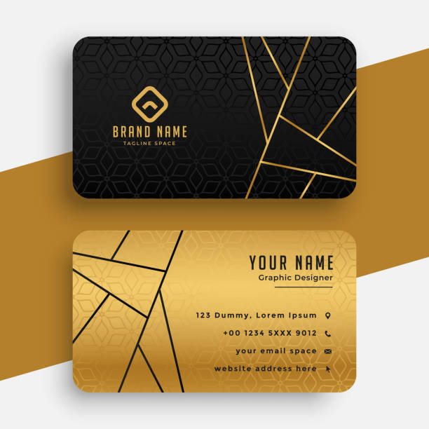
Custom Metal Business Cards: How to Design One That Actually Feels Like *You*
Thinking about leveling up your business card game with metal? Good call. A metal business card instantly sets you apart and if you get the design right, it can say everything about your brand before you even say a word.
But there’s a lot more to it than just slapping your logo on a shiny rectangle. Let’s break down exactly what you need to know (and do) to create a metal business card that really reflects who you are.
Step 1: Pick the Right Metal & Finish
This is where your card’s personality starts. Each metal tells a different story:
Aluminum: Modern, lightweight, and budgetfriendly.
Brass/Copper: Feels warm, classic, even a bit vintage.
Stainless Steel: All about strength, durability, and a hightech vibe.
Pro tip:
The finish matters just as much as the metal! Brushed textures give you contrast and hide fingerprints, highgloss pops color, and etched surfaces add depth. And don’t forget some metals are easier (and cheaper) to work with than others. If you’re considering taking your brand to the next level, check out metal business cards for inspiration and options.
Questions to ask yourself:
Does this metal vibe with my brand?
Is it durable enough for daily handling?
Will my logo and text actually show up?
Step 2: Nail the Details Engraving, Etching, & Surface Treatments
When it comes to metal, the details *literally* make an impression. Here’s how to get them right:
Engraving Precision
Sharp, clean lines make your info readable and your brand look premium.
Make sure the depth and width of engraving match your chosen metal too deep and it looks clunky, too shallow and it’ll fade.
Surface Treatments
Microsand, hammered, satin, highgloss these textures don’t just look cool, they *feel* cool.
Want your design to last? Go for coatings that resist fingerprints and corrosion.
Think about:
Do you want your card to feel bold and flashy, or subtle and sophisticated? The texture and finish will help set that tone instantly.
Step 3: Show Off Your Logo & Brand Identity
Your logo is the star of the show. Make sure it gets the attention it deserves!
How to do it:
Place your logo front and center (literally or visually it just needs to be seen first).
Use brand colors that pop against the metal, but don’t overdo it. Consistency is key.
Keep things uncluttered let your logo breathe.
> Designer tip:
> Embossing or etching your logo can give it a tactile, highend feel that people WILL notice.
Step 4: Typography Don’t Let Your Info Disappear
Metal can be tricky for text. Here’s how to make sure your name and contact details don’t get lost in the shine:
Go bold: Use thicker fonts for your name and key info.
Mind the spacing: Letters need room to breathe, especially with reflections.
Contrast is king: Choose colors and finishes that make your text pop, not fade.
Test it: Look at your design in different light if you can’t read it at a glance, tweak it.
Step 5: Color, Texture, and Visual Pop
Your metal card is a mini billboard. Make it count!
Color psychology: Blues feel trustworthy, golds and coppers feel premium, black is always classic.
Texture: Matte = understated. Glossy = bold. Brushed = cool and industrial.
Keep it simple: Stick to a tight color palette that matches your brand.
Quick check:
Does your card catch the eye from across the table? Does it feel nice in the hand? If the answer’s yes, you’re on the right track.
Step 6: Practical Stuff Durability, Cost, and Matching Your Brand Materials
You want your card to last and look great without busting your budget, right?
Durability: Thicker cards last longer but weigh more and cost more. Find your sweet spot.
Finish: Choose one that resists fingerprints and scratches.
Budget: Ask about setup fees, batch pricing, and finishing costs before you commit.
Consistency: Make sure the card’s look and feel matches your other brand materials (website, stationery, packaging, etc.).
> Bonus tip:
> Always order a prototype! Test it in real life before you go allin on a big batch.
TL;DR How to Make Your Metal Business Card *Actually* Work for Your Brand
- Choose a metal and finish that fits your vibe.
- Get the details right with quality engraving and treatments.
- Make your logo pop, but keep it clean and uncluttered.
- Use bold, readable typography and test for legibility.
- Pick colors and textures that scream “you.”
- Balance durability, cost, and consistency with your brand.
Done right, your metal business card isn’t just a way to share your info it’s a conversation starter and a statement piece. Now go make something awesome!